Why does the TTT-plot make sense?
- If the failure rate is monotonically increasing, we know that the probability density function is rather "bellshaped", i.e., it increases, and then drops again
- The more "peaked" the distribution is the, "sharper" is the failure rate function
Constructed example
- Assume we have 11 observations, where $t_{(1)} = t_{(11)}/4$, $t_{(2)}=t_{(3)}= \ldots = t_{(9)}= t_{(11)}/2$ and $t_{(10)} = 3t_{(11)}/4$
- That is, most points are exactly half the way towards the highest value, and we have one point at 25%, and one point at 75% of the highest value
- This will be a very clear indication of an increasing failure rate function, i.e., before half the way it is almost impossible to fail, but the majority of the items fail "at the middle"
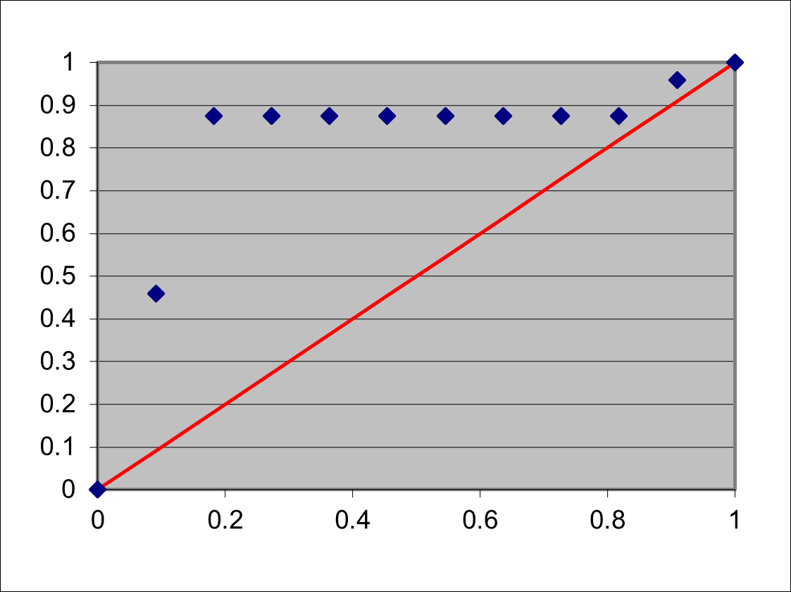
The TTT plot
- The TTT for the highest value will be $\mathcal{T}(t_{(11)}) = 6t_{(11)}$
- The normalized TTT for the lowest value will be $\mathcal{T}(t_{(1)}) / \mathcal{T}(t_{(11)}) =11/24 \approx 0.46$ which is higher than $1/11 \approx 0.46$, i.e., above the diagonal
- For be $t_{(2)}$ we get $\mathcal{T}(t_{(2)}) / \mathcal{T}(t_{(11)}) \approx 0.88$ which is higher than $2/11 \approx 0.18$, i.e., extremely above the diagonal
- For be $t_{(2)}, t_{(3)}, \ldots t_{(9)}$ we get the same value for $\mathcal{T}(t_{(i)}) / \mathcal{T}(t_{(11)}) \approx 0.88$ where the value of $i/11$ increases. But the plot is still above the diagonal.
- Finally, for $t_{(10)}$ $\mathcal{T}(t_{(10)}) / \mathcal{T}(t_{(11)}) \approx 0.97 > 10/11 \approx 0.91$
- The plot is shown below, and it is easy to see that if we localize very many points very close to the average value, the TTT-observator increases much more than $i/n$, hence the plot will be above the diagonal